

"Above all I wish to see."
Donna Goddard
We need light to see, but contrast is also important. The combination of good quality lighting and distinct contrast of light and dark values helps the viewer to see objects and navigate a space. It is important to understand what constitutes quality of light, quantity of light and recommended value contrast in the visual environment.
Bringing daylight into the home is very important. As our eyes age, less light actually gets to the retina, therefore, higher levels of light (without glare) are required. The intensity of daylight is much greater than typical electric lighting, plus daylight includes the full spectrum of light. Furthermore, because natural daylight is free, there are significant economic and health reasons to include the principles of "daylighting design" into your home.
Appropriate design criteria will vary depending upon your geographic location, so it is best to contact a local lighting designer or architect who specializes in "daylighting design".
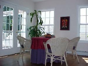
The most successful solutions bring the daylight into a space above the field of view through clerestory windows or skylights with diffused glazing material. Rays of sunlight through clear glass or plastic can produce both unwanted glare and shadows.
Older eyes benefit from increased quantity and quality of light:
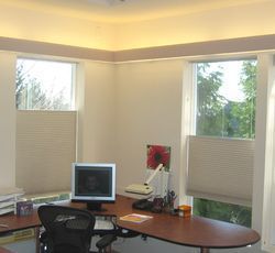
Indirect light from the valances above the bookcases bounce light off the ceiling to light the space. The top down-bottom up shades are adjustable so that there is no direct sunlight on the tasks, but ample daylight coming in to light the space.
Quantity of Light
Ambient (general) illumination should be about three to four times higher than is typical for young people. For older people, an ambient level of 30 footcandles is generally recommended for ambient room lighting, but this quantity of light may not meet your needs. Light levels should be adjustable by dimmers to allow changes according to the seasons and time of day. Bedroom and bathroom areas should have separate lighting for day and night, high light levels during the day and low at night. Amber colored night lights should be placed in the bedroom, along the path to the bathroom and in the bathroom. Amber light will not disrupt sleep in the same way that white or blue light will do. Every room, including the living room and family room, should have built-in lighting with control switches at each location where people enter or exit a room. Motion sensors may be used so that lights come on only when rooms are occupied. Table and floor lamps can be used in combination with built-in general illumination for conversation groups or to address task lighting.
Quality of Light
Many factors affect the quality of lighting:
- Uniformity in general lighting (with areas of interest that are not dramatically different)
- Glare avoidance (direct and reflected)
- Reduction of visual busyness
- Good color rendering
- Location and directional considerations to prevent accidents
- Walls and floor areas evenly illuminated
- Light levels that are adequate for the visual task
- Orientation of lighting to the visual task
As we age, our eyes become much more sensitive to glare. The highest rate of increased glare sensitivity occurs after the age of sixty. There are two types of glare: 1) direct glare, bright light from a fixture or bright sunlight streaming into a dimly lit room; and 2) reflected glare, strong light that bounces off a smooth shiny surface.
Avoiding Direct Glare
The best way to avoid direct glare is to utilize indirect lighting fixtures. This is accomplished by using a concealed light source where light is directed toward a ceiling or wall and reflected back into the room. It is important that the surface of the ceiling or wall be a matte finish and light in color. Exposed bulbs such as the tiny lights on a chandelier will produce direct glare and should be fitted with a translucent shade. Sheer draperies or woven window shades should be used to minimize glare and yet allow daylight into the room.
Avoiding Reflective Glare
Problem areas include glass-top tables, highly polished floors and/or counters and light-colored sidewalks. Reflected glare can be avoided by using materials with a matte finish or colors with a medium value. Undercabinet task lights will reflect light and glare from highly polished granite countertops. It is best to use a honed finish instead of polished stone countertops.
Providing Task Lighting
Consideration should be given to increased light levels in areas for reading, hobbies, and daily activities.
-
Daylight and task light in the hobby and reading room.
-
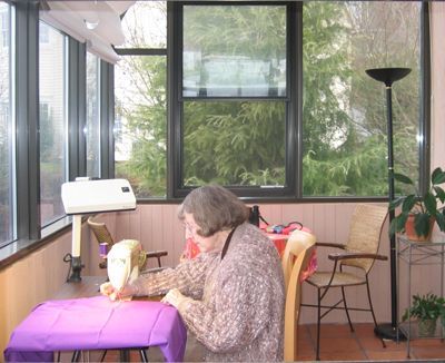
Many people prefer daylight to do visual tasks like mending or sewing, or even working a puzzle. The light is much brighter than task lights and the colors are more vivid.
For vanities, fixtures located on each side of the mirror that illuminate both sides of the face for shaving and applying make-up are important.
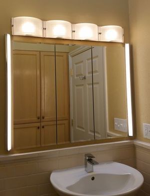
The light above the mirror is to light the space. The two vertical lights are for grooming and aimed at the user standing in front of the sink.
Closet areas require light that does not alter the color of the clothing and is sufficient to distinguish dark colors (i.e. navy and black). Light sources have a color rendering index (CRI) which rates them on a percentage scale (high numbers being the best) for how true a color will appear under that light source. Sources rated 80 or above are recommended.
Value and Value Contrast: Value is the lightness or darkness of a color. Value Contrast is the ratio of light to dark; a greater ratio enhances visibility especially for people who are visually impaired. A separation of 30 points between two surfaces or between a surface and an object is recommended. This can be measured by comparing the light reflectance value (LRV) of each surface or object. If you have a fan deck of paint chips, you can match the color of each item then compare the LRV of each one. The LRV will be listed in the specification or index. To help people navigate a space, provide a 30-point separation between the floor and the walls, or the wall and door frame. To prevent falls, you may want to increase the value contrast to 50 points for the leading edge (nosing) of a stair tread, compared to the surface of the tread. Adding a contrasting edge to countertops helps to define the vertical from the flat surface.